




mediterraneo
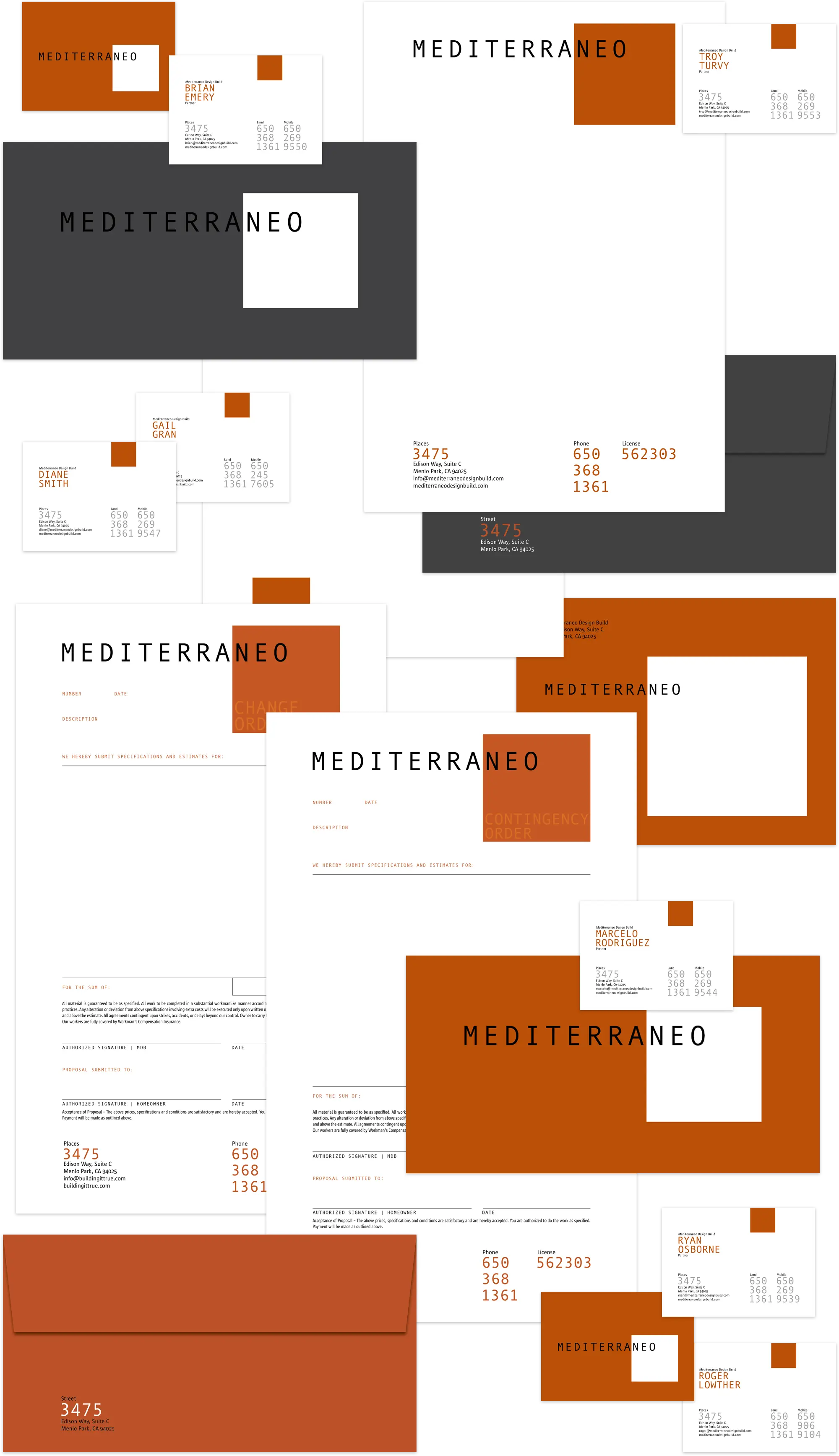
Mediterraneo’s partners felt their name pigeon-holed them as builders specializing in Mediterranean-style home design and construction. For this reason they wanted to abandon it. Twenty years of equity in that name would have been a lot to sacrifice, so we advised them to keep the name but redesign the logo — a task which was, in fact, overdue. We married “Mediterraneo” with a square field in a manner that emphasizes the last three letters, “neo.” This combination is a visual / verbal reference to new space, form and structure. The brand color palette is dominated by terra cotta and cement — two prominent colors in California construction, with gritty photography of their crews hard at work, and architectural-style imagery of their projects rounding out the brand expression.
Mediterraneo’s landing page animation was inspired by their high-end construction chops. It playfully brings their logo to life as if it were actually being built with hammers, nails, saws and cranes.
June 5, 2026