




zane
Zane MacGregor is a sophisticated real estate brokerage in Palo Alto, California. The company’s original logo was designed to communicate professionalism, akin to a law firm, and positioned them effectively versus early competition. But times change. Real estate exploded in the Bay Area — on the Peninsula in particular — and their brand image no longer represented leadership or innovation — two characteristics highly valued by Peninsula home buyers.
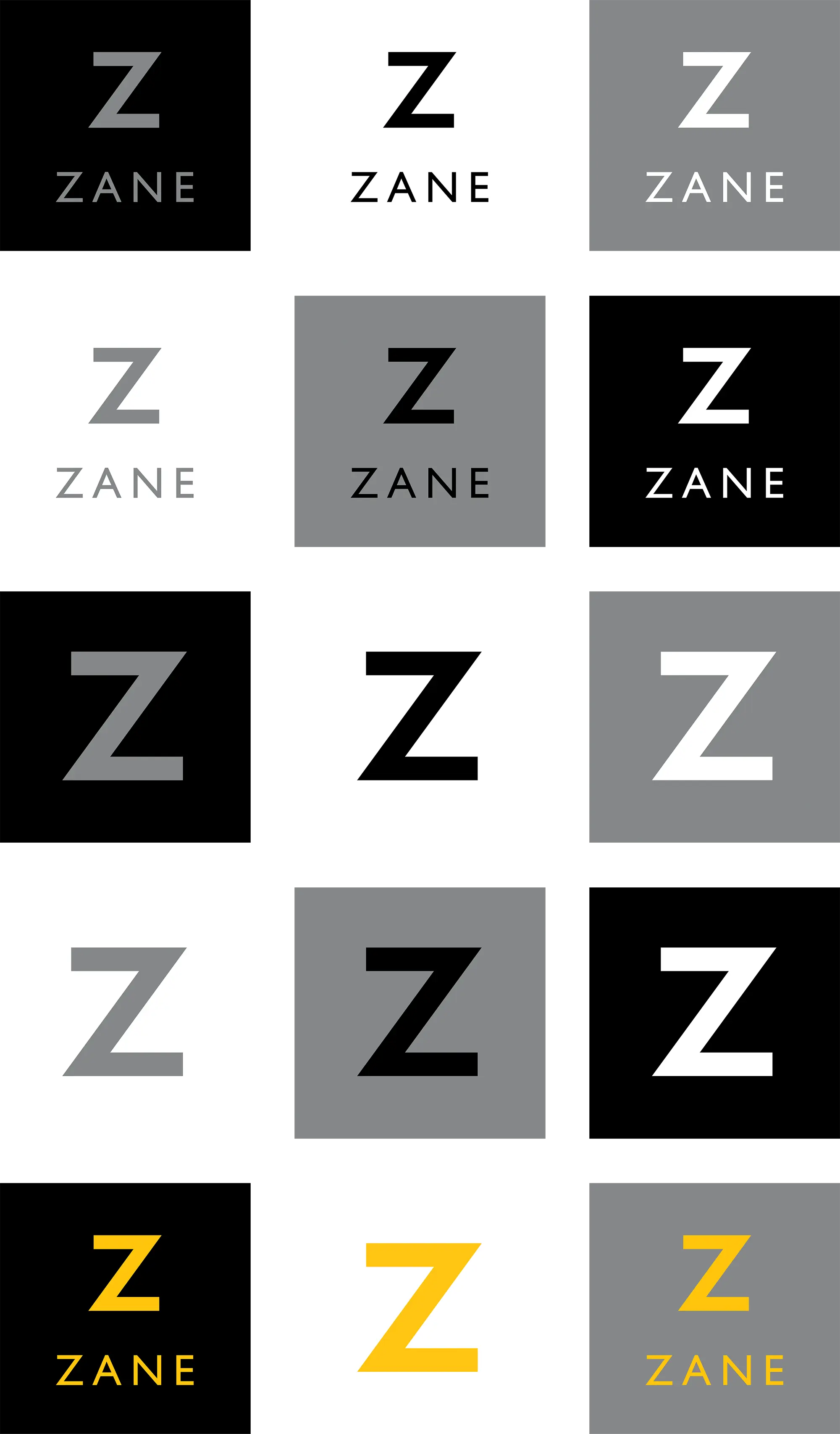
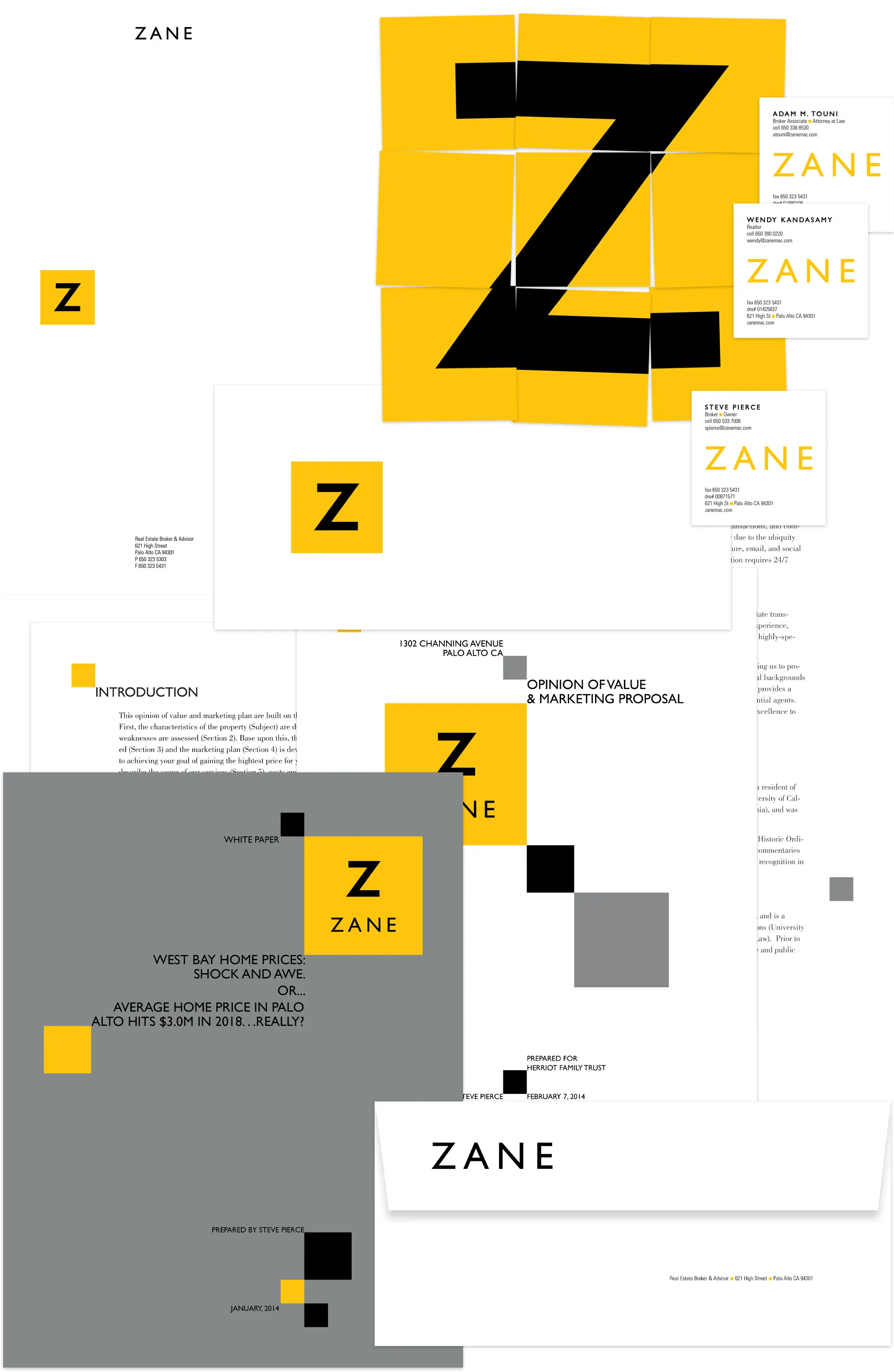
We suggested (and Zane agreed) to drop “MacGregor” from the firm name as it was both no longer relevant and difficult to spell correctly. The new brand identity took on a crisp, professional tone by isolating the Z letterform in a square box, and through the use of a simple palette, including a strong yellow — a color not used by any competitors in the greater San Francisco area. Some iterations are paired with the name, and there is a range of treatments for use on different items, from business papers to brochures to property signage.
July 28, 2026